Clarity
Readable hierarchy with limited visual noise.
Lethavia / Brand
The Lethavia visual system combines a strong technology presence, calm mineral surfaces, and an editorial structure designed to remain coherent as the company evolves.
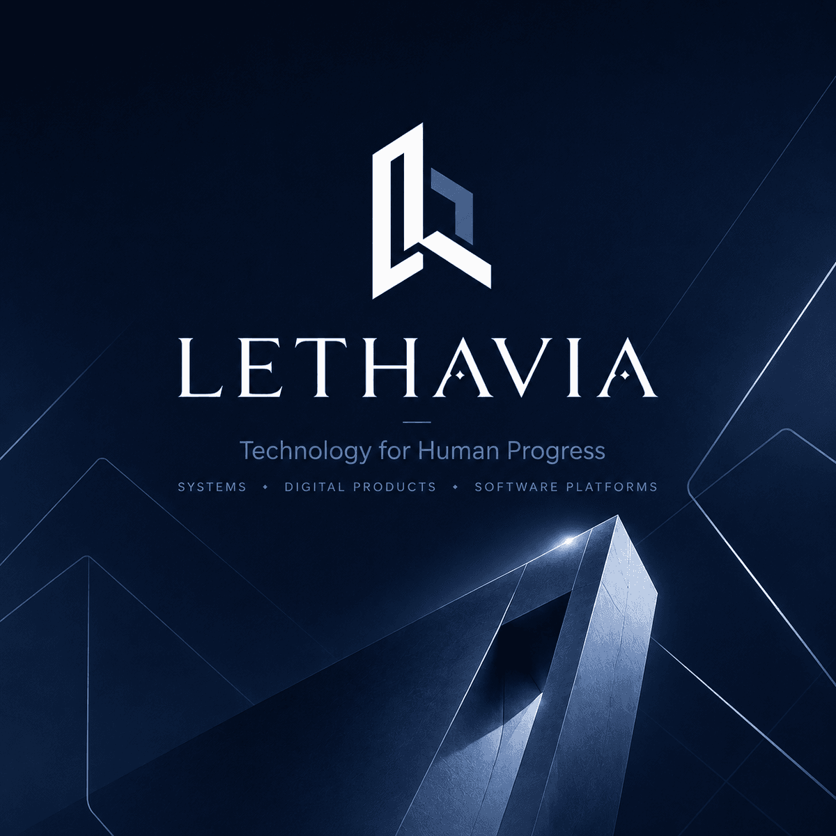
The Lethavia symbol is based on a dimensional geometric construction. Its facets suggest a foundation, forward direction, and the letter L without reproducing another technology company’s identity.
The wordmark, proportions, colours, and clear space must remain unchanged. Any external use or special adaptation should be confirmed before publication.
System / 03
Readable hierarchy with limited visual noise.
The same rules of proportion, rhythm, and contrast across each surface.
A restrained identity that can evolve without relying on a short-lived trend.
Contrast, sizing, and behaviours designed for real use.
Colour / 04
Deep ink carries the structure, desaturated indigo identifies the brand, and the mineral accent remains deliberately rare.
Brand requests
Public files will be offered once usage rules and official versions are finalized. A specific request can already be assessed.